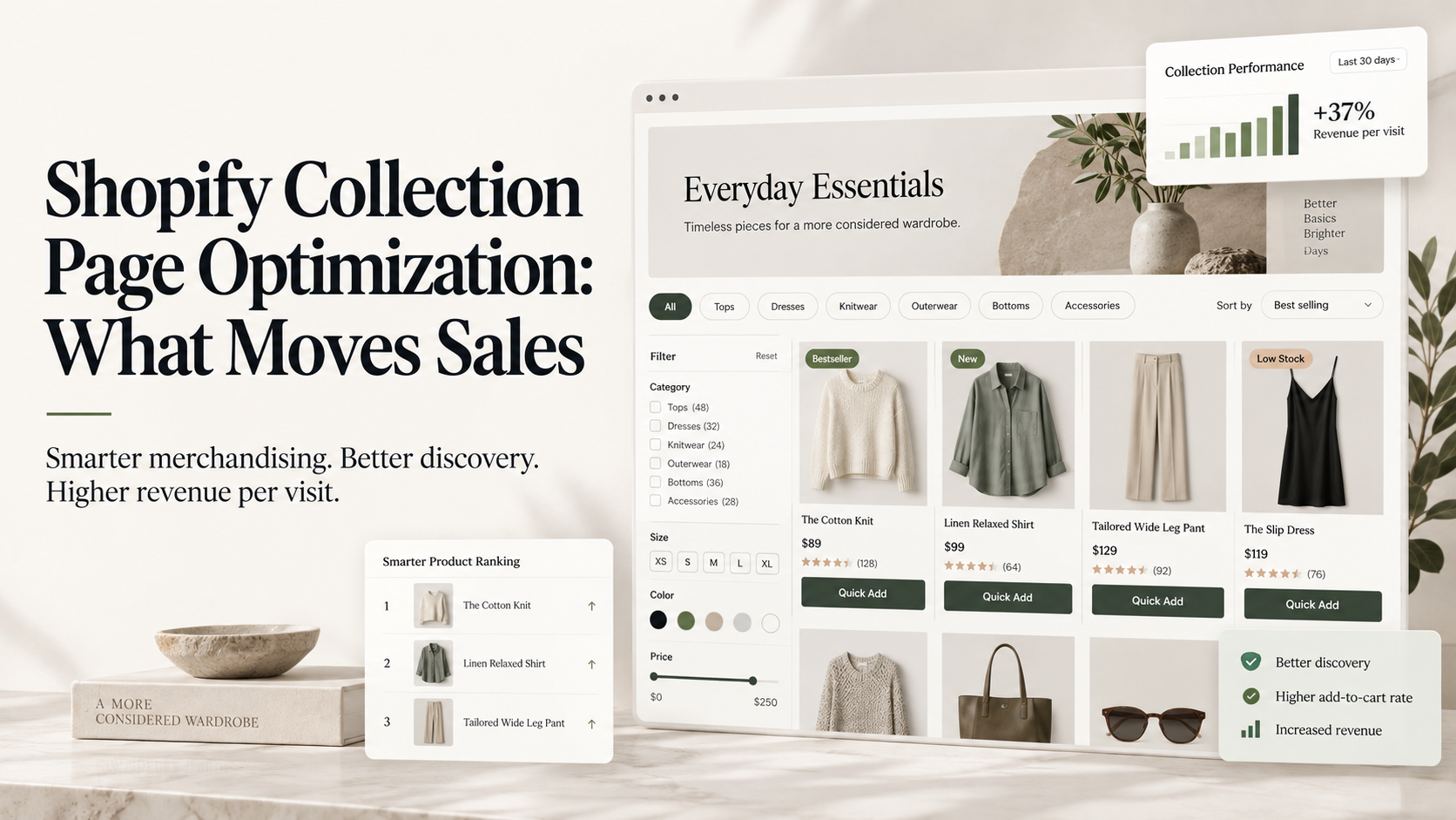
The collection page is where most Shopify shoppers decide what to consider, and it is usually running whatever order the theme shipped with. Fix three things in order: the default sort, the filters, and how many products are visible above the fold on a phone. Those three account for most of the available gain.
Why this page is under-tested
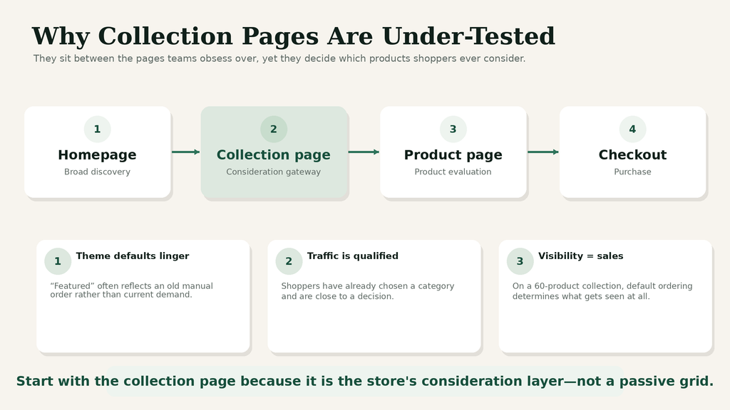
It sits between the two pages everyone optimises. Homepage tests are visible to stakeholders and product page tests feel closest to the money, so the collection page inherits theme defaults and stays that way for years.
That default is usually “featured”, which in practice means the order someone dragged products into eighteen months ago. On a store with sixty products in a collection, that ordering decides which products get seen at all.
Meanwhile the traffic is significant and highly qualified. A shopper on a collection page has already chosen a category. They are further down the funnel than a homepage visitor and closer to a decision than most people give them credit for.
Fix one: the default sort order
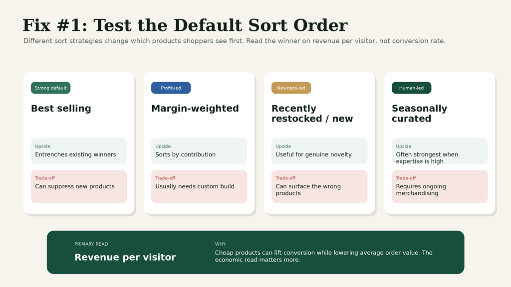
Test it against revenue per visitor, not against conversion rate.
The candidates worth running:
Best selling. A reasonable default and it entrenches whatever already sells, which suppresses new products.
Margin-weighted. Rarely available out of the box, usually worth building. Sorting by contribution rather than popularity changes what the store makes per session.
Recently restocked or new. Works for brands with genuine newness. Actively harmful for brands with a stable catalogue, because it surfaces whatever changed last rather than whatever sells.
Manual, curated seasonally. Labour-intensive and often the winner, because a human who knows the catalogue beats an algorithm sorting on one variable.
Whatever you test, the read is revenue per visitor. Sorting cheap products first will lift conversion rate and lower average order value, which is the same trap that catches discount tests. Winners in DRIP’s data produced a median 1.88% conversion lift against a 2.77% revenue per visitor lift, and sort-order tests sit exactly on that divergence.
Fix two: filters that match how people shop
Most Shopify filter sets are built from the product data that happens to exist rather than from the questions shoppers actually ask.
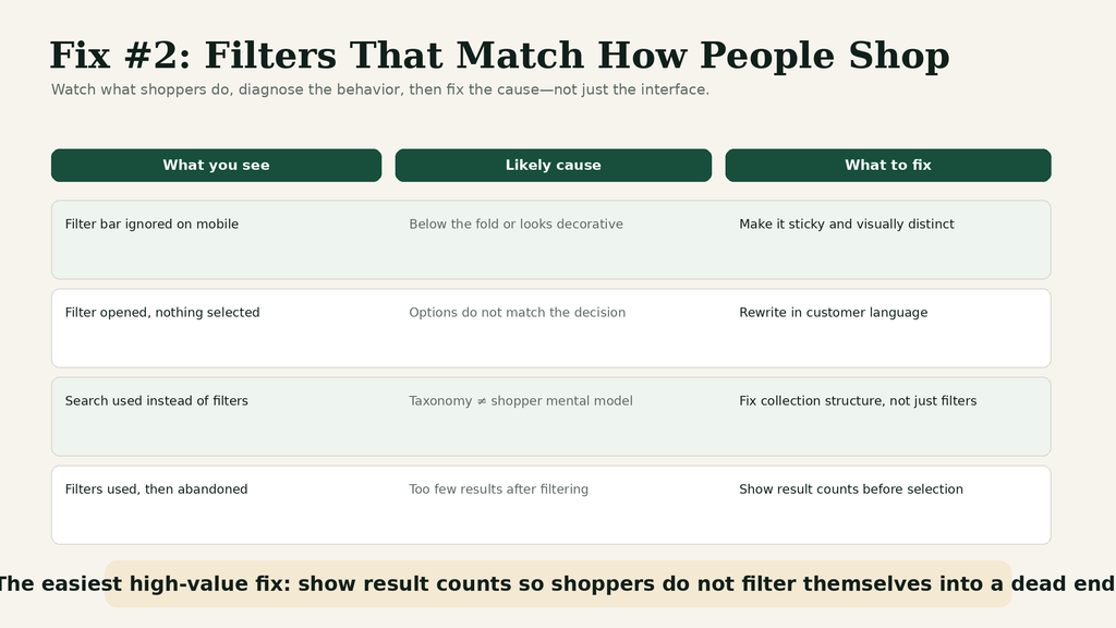
Watch ten session recordings on a collection page before touching anything. You are looking for people scrolling past the filter bar entirely, opening it and closing it without selecting, or using search instead. Each of those is a different problem.
| What you see | Likely cause | Fix |
|---|---|---|
| Filter bar ignored on mobile | It is below the fold or looks like decoration | Make it sticky and visually distinct |
| Filter opened, nothing selected | Options do not match the decision being made | Rewrite from customer language, not product data |
| Search used instead of filters | The taxonomy does not match the mental model | Collection structure problem, not a filter problem |
| Filters used then abandoned | Too few results after filtering | Show result counts before selection |
That last row is the most common and the easiest to fix. Showing the count next to each filter option prevents the dead end where a shopper filters into zero results and leaves.
Fix three: the mobile fold
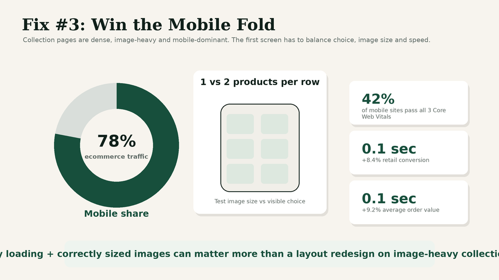
This is where the traffic is and where the layout is least considered. Mobile carries around 78% of ecommerce traffic while converting at roughly two-thirds the desktop rate, and collection pages are particularly exposed because they are dense grids designed on wide screens.
Two products per row or one? More products visible means more choice and smaller images. Fewer means better imagery and more scrolling. There is no universal answer and it is genuinely testable.
Speed matters more here than almost anywhere else, because collection pages load many images at once. Only around 42% of mobile sites pass all three Core Web Vitals, and Google and Deloitte’s analysis of over 30 million mobile sessions associated a 0.1 second improvement in mobile load time with an 8.4% rise in retail conversion and a 9.2% rise in average order value. Lazy loading and correctly sized images do more for a collection page than any layout change.
What to test after the first three
Once sort, filters and the mobile fold are handled, the next tier is worth working through in order.
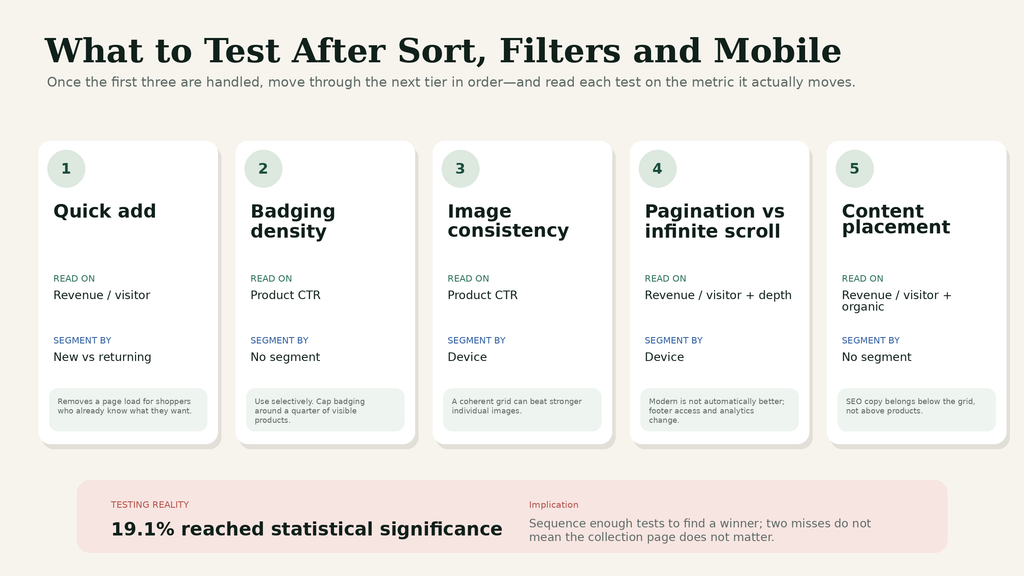
Quick add to cart. Adding a variant selector directly to the grid removes a page load for shoppers who already know what they want. It helps returning customers and can hurt first-time shoppers who needed the product page to build confidence. Segment the read by new against returning or the two effects will cancel out.
Badging. Best seller, low stock, new. These work and they degrade fast if overused. A collection where nine products in twelve carry a badge has communicated nothing. Cap badging at roughly a quarter of visible products and test the cap, not just the badge.
Imagery consistency. A grid mixing lifestyle shots and cut-outs reads as noise. Consistency at the grid level often outperforms better individual images, which is counter-intuitive enough that it is worth testing rather than assuming.
Pagination against infinite scroll. Infinite scroll feels modern and it makes the footer unreachable, which matters if your trust signals live there. Pagination gives you cleaner analytics on depth. Neither wins universally.
Collection content placement. If SEO requires written content on the page, it belongs below the grid. Pushing products below a block of text costs more in conversion than it gains in rankings, and the two goals are not actually in conflict once the placement is right.
| Test | Read on | Segment by |
|---|---|---|
| Quick add | Revenue per visitor | New vs returning |
| Badging density | Click-through to product | None needed |
| Image consistency | Click-through to product | Device |
| Pagination vs infinite scroll | Revenue per visitor, scroll depth | Device |
| Content placement | Revenue per visitor, organic sessions | None needed |
Expect a low hit rate here, as everywhere. ConversionTeam’s audit of 2,288 tests found 19.1% reached statistical significance per test, so sequence enough of these to reach a winner rather than concluding after two that collection pages do not matter.
What the research layer looks like in practice
At a personal care brand we work with, strict brand guidelines ruled out most of the layout changes we would normally reach for. Heat map data drove a navigation redesign instead, because the maps showed a specific pattern in how shoppers moved between categories that the analytics alone did not surface.
The sequence is the transferable part. Heat maps generated the hypothesis, session recordings confirmed the mechanism, and a test proved it. Skipping either of the last two steps means redesigning a collection page on the basis of colour intensity, which is how most collection page work goes wrong.
Never tested your collection pages? Shopify CRO starts with the merchandising layer because it is usually the largest untested surface on the store.
How this rolls out across a catalogue
Collection page work is template work, which changes how you test and how you ship.
Test on the template, not on a single collection. A winner on one collection may be a property of that collection’s products rather than of the change, and you will only find out when you roll it out everywhere and the gain evaporates.
Then re-measure a fortnight after full rollout. Winners commonly shrink when they move from a variant on half the traffic to the permanent experience across a whole catalogue, because the test ran on your highest-traffic collections and the effect does not always transfer to the long tail.
Check the collections you did not think about. Sale, new arrivals, and any collection built by an automated rule tend to inherit template changes in ways nobody anticipated. Walk three of them on a phone after rollout before calling the work finished.
One measurement note worth setting up first. Most analytics configurations do not distinguish a product view that came from a collection page from one that came from search or a direct link. Adding that distinction takes an afternoon in GTM and it is what turns collection page testing from guesswork into something you can actually read, because click-through to product is the metric most of these tests move first.
Frequently asked questions
What is the best default sort order for a Shopify collection?
There is no universal answer, but margin-weighted or curated ordering usually beats “featured”, which is typically a manual order nobody has revisited. Test against revenue per visitor rather than conversion rate.
How many products should show per row on mobile?
Both one and two work depending on how visual the product is. It is one of the few genuinely testable layout questions on a collection page, because the trade-off between image size and choice is real.
Do collection page filters affect conversion?
Yes, particularly filters that lead to zero results. Showing result counts beside each option prevents the most common dead end.
Should collection pages have written content for SEO?
A short, genuinely useful introduction can help, placed below the product grid rather than above it. Pushing the grid below a block of keyword text costs more in conversion than it gains in rankings.
Next step: Website Conversion Optimization covers how template-level tests roll out across a whole catalogue.