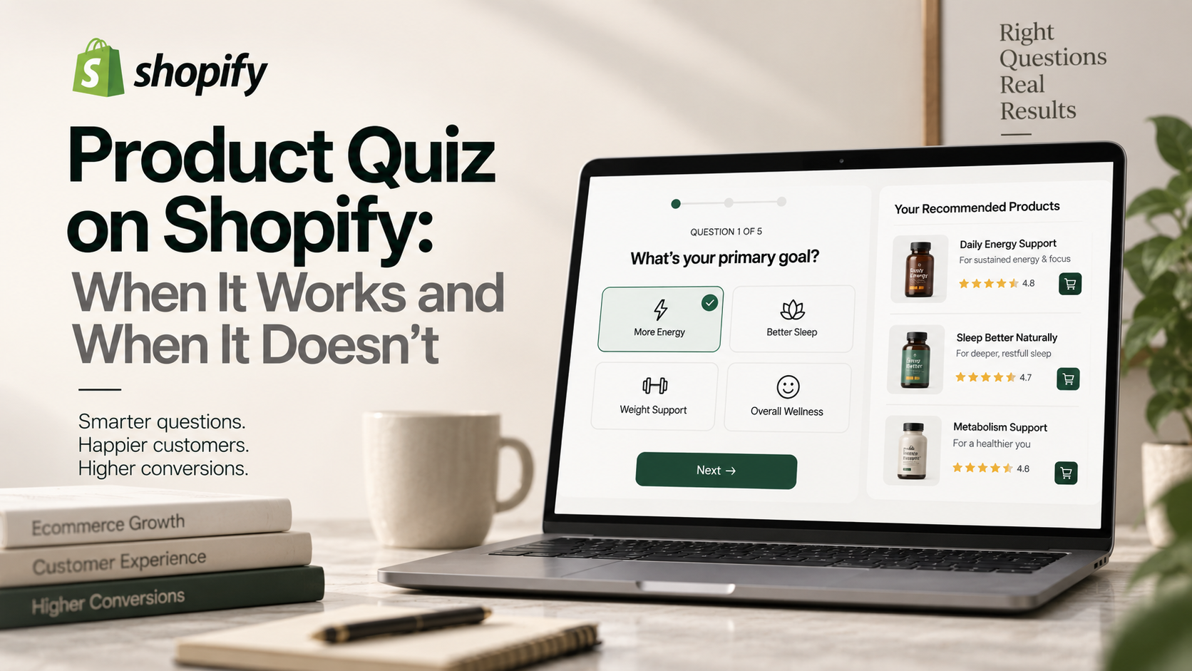
A product quiz earns its place when the customer genuinely cannot tell which variant suits them and the catalogue is large enough that browsing is work. If your range is six products and the difference is obvious, a quiz adds steps between the shopper and the buy button. Decide that question before building anything.
The test for whether you need one
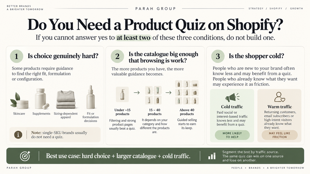
Three conditions. If you cannot answer yes to at least two, do not build it.
Is choice genuinely hard? Skincare, supplements, sizing-dependent apparel and anything with a fit or formulation dimension qualify. A single-SKU brand does not.
Is the catalogue big enough that browsing is work? Under roughly fifteen products, good filtering and clear product pages beat a quiz. Above forty, guided selling starts earning its keep.
Is the shopper cold? Paid traffic arriving from an interest-based audience knows less than someone who searched your brand. A quiz is a diagnostic tool for cold traffic, and it is friction for warm traffic that already knows what it wants.
That third condition is why the same quiz can win on one traffic source and lose on another, and why the test has to be segmented by source or it will average out to nothing.
Where quizzes go wrong
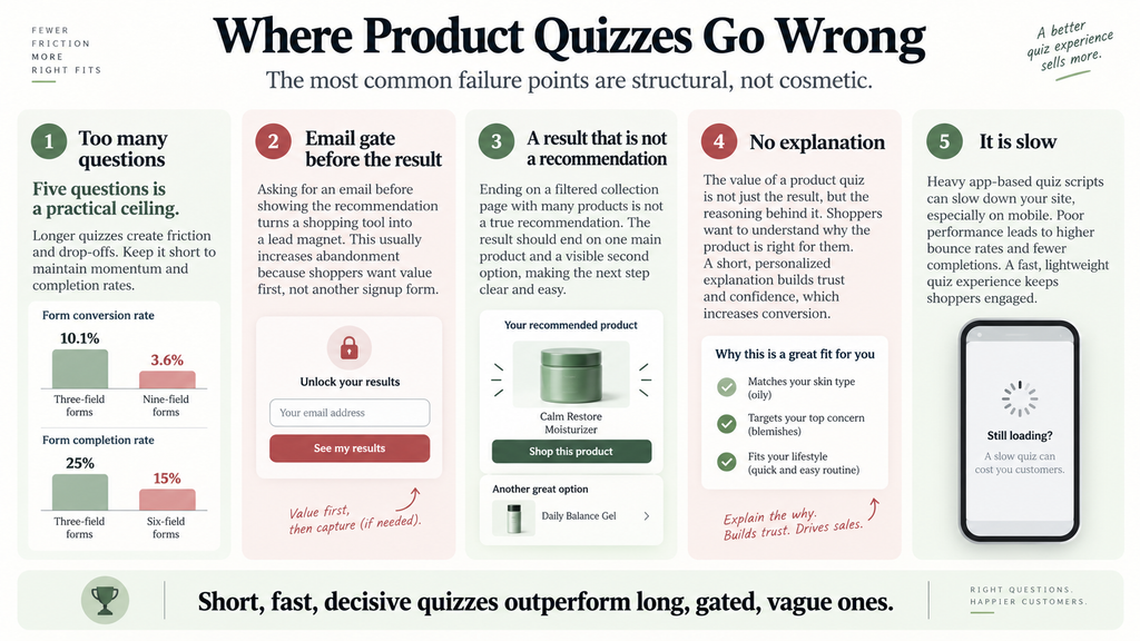
Too many questions. This is the dominant failure. Form length destroys completion: analysis of Unbounce’s 2026 benchmark data shows three-field forms converting at 10.1% against 3.6% for nine-field forms, and HubSpot research cited by LeadsuiteNow puts three-field forms at 25% completion against 15% at six fields, with each field costing roughly 11%. Quizzes behave the same way. Five questions is a working ceiling.
Email gate before the result. Gating the recommendation behind an email capture converts the quiz from a shopping tool into a lead magnet. Sometimes that is the goal. Usually it costs more in abandoned quizzes than it gains in addresses. Ask after the result, not before.
A result that is not a recommendation. If the quiz ends on a filtered collection page with eleven products, it has not made a decision for anyone. End on one product, with a reason, and a clear path to a second option.
No explanation. “Based on your answers, we recommend X” is weaker than “You said you have sensitive skin and want a lightweight texture, so X”. The reasoning is the value.
It is slow. Quizzes are usually app-based and app-based means additional scripts. Only around 42% of mobile sites pass all three Core Web Vitals, and adding a heavy quiz app to a page that already fails them makes the problem worse in the exact place mobile shoppers meet it.
How to measure it properly
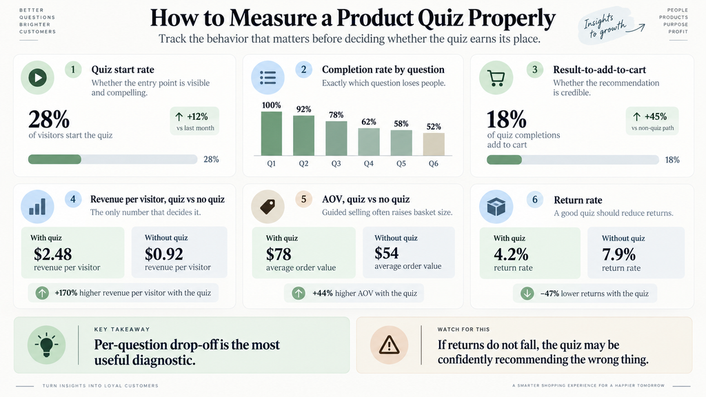
| Metric | What it tells you |
|---|---|
| Quiz start rate | Whether the entry point is visible and compelling |
| Completion rate by question | Exactly which question loses people |
| Result-to-add-to-cart | Whether the recommendation is credible |
| Revenue per visitor, quiz vs no quiz | The only number that decides it |
| AOV, quiz vs no quiz | Guided selling often raises basket size |
| Return rate | A good quiz should reduce returns |
The per-question drop-off is the most useful diagnostic and the one most brands never look at. It usually shows a single question doing all the damage, and it is usually the one asking for something the shopper does not know about themselves.
Return rate deserves attention too. If the quiz is recommending well, returns should fall. If they do not, the quiz is confidently recommending the wrong thing, which is worse than no quiz.
Testing it without wasting a quarter
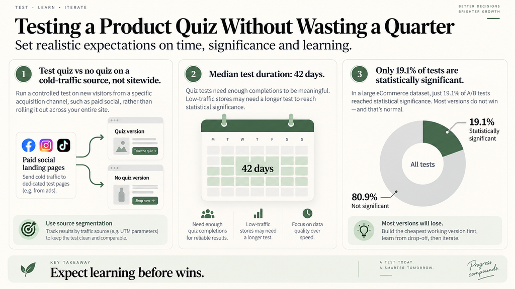
Do not test quiz against no quiz sitewide. Test it on a specific traffic source where the cold-traffic condition holds, most obviously paid social landing pages.
Expect the read to take time. The median test in DRIP’s database ran 42 days, and quiz tests need enough completions to be meaningful, which on a low-traffic store can take considerably longer.
Expect most versions to lose. ConversionTeam’s audit of 2,288 tests found 19.1% reached statistical significance per test. Build the cheapest working version first, learn from the per-question drop-off, and iterate before investing in a polished build.
Building the cheapest version that answers the question
Before committing to an app subscription and the page weight that comes with it, build the version that tests the hypothesis rather than the version that looks finished.
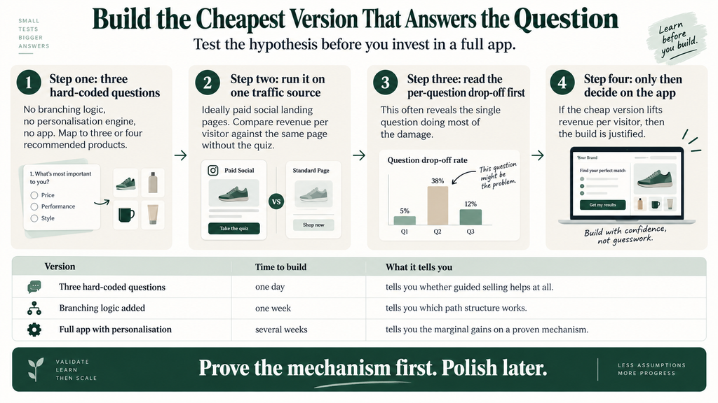
Step one: three questions, hard-coded. No branching logic, no personalisation engine, no app. A three-question form that maps to three or four recommended products can be built in a day and it answers the only question that matters, which is whether guided selling helps this audience at all.
Step two: run it on one traffic source. Paid social landing pages, where the cold-traffic condition holds. Measure revenue per visitor against the same page without the quiz.
Step three: read the per-question drop-off before anything else. This is the most valuable output of the cheap version. It will usually show one question doing most of the damage, and that finding survives into every future version.
Step four: only then decide on the app. If the cheap version moved revenue per visitor, you now have evidence to justify the build. If it did not, you have saved a quarter and a subscription.
| Version | Build cost | What it tells you |
|---|---|---|
| Three hard-coded questions | One day | Does guided selling help at all |
| Branching logic added | One week | Which path structure works |
| Full app with personalisation | Several weeks | Marginal gains on a proven mechanism |
The maintenance cost nobody budgets
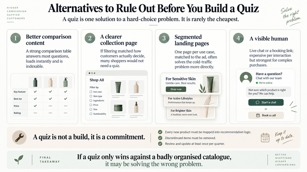
A quiz is not a build, it is a commitment. Every product added to the catalogue needs mapping into the recommendation logic, and every product discontinued needs removing.
The failure mode is silent. Six months after launch the quiz is confidently recommending a product you stopped selling, or funnelling everyone toward the same three items because the newer range was never mapped. Nobody notices, because nobody is looking at a tool that was declared finished.
Put a quarterly review in the calendar at launch: does every current product appear in at least one recommendation path, does every path end on something in stock, and has the per-question drop-off changed. Fifteen minutes, four times a year, and it prevents the most common way quizzes stop earning their place.
The adjacent finding worth knowing
At a supplements brand we work with, the meaningful insight was about cold versus warm traffic messaging rather than the quiz format itself: the same page needed to say different things depending on whether the visitor already knew the brand. Paid landing page conversion improved by 40% with no change in media spend once that distinction was built into the pages.
A quiz is one way to solve that problem. It is not the only way, and it is the most expensive one to build. Test the messaging split first, because if segmented copy solves it, you have saved yourself an app subscription and a page weight penalty.
Considering guided selling? Shopify CRO covers whether a quiz is the right tool for your catalogue before anyone builds one.
The alternatives worth ruling out first
A quiz is one solution to the problem of a customer who cannot choose. It is rarely the cheapest.
Better comparison content. A single well-built comparison table across your range answers the same question for most shoppers, loads instantly, and is indexable, which a quiz is not.
A clearer collection page. If filtering matched how customers actually decide, a large share of quiz traffic would never have needed the quiz.
Segmented landing pages. One page per use case, matched to the ad that drove the click. This solves the cold-traffic problem directly and often outperforms a quiz because it removes steps rather than adding them.
A visible human. Live chat or a booking link for high-consideration products. Expensive per interaction and unbeatable for conversion on complex purchases.
Rule these out before building, because a quiz that wins against a badly organised catalogue has not proven the quiz was necessary. It has proven the catalogue was hard to navigate.
Frequently asked questions
How many questions should a product quiz have?
Five at most, and fewer is usually better. Completion falls sharply with each additional question, and the per-question drop-off report will show you which one is doing the damage.
Should I gate the quiz result behind an email capture?
Usually not. Ask for the email after showing the recommendation. Gating before the result converts a shopping tool into a lead magnet and costs completions.
Do product quizzes actually increase conversion?
They can, when choice is genuinely difficult and the catalogue is large. On small catalogues with obvious differences they add steps and reduce conversion. Test by traffic source rather than sitewide.
What should a quiz result page show?
One recommended product, the reason it was chosen in the customer’s own words, and a visible second option. A result that lands on a filtered collection has not made a decision for anyone.
Next step: Landing Pages covers the cold-traffic messaging work that a quiz is often built to solve.