A post-purchase survey earns its place if the answers change what you test next. One question about hesitation and one about attribution will do more than a ten-question form nobody finishes. Ask on the confirmation page, keep it to two questions, and write each one so a wrong answer is still useful.
Why the confirmation page is the right place
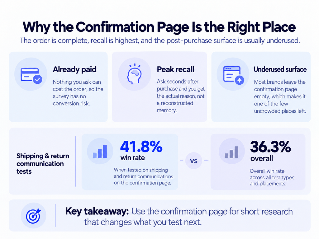
The customer has already paid. Nothing you ask can cost you the order, which removes the constraint that governs every other survey placement on the site.
They are also at peak recall. Ask two days later by email and you are asking someone to reconstruct a decision they have stopped thinking about. Ask ten seconds after purchase and you get the actual reason.
And the surface is almost always empty. Most brands run whatever the platform shipped on the confirmation page, which is why this is one of the few uncrowded areas left. In DRIP’s experiment data, shipping and return communication tests had the highest win rate of any category at 41.8%, against 36.3% overall. Post-purchase surfaces reward attention because so few brands give them any.
The two questions worth asking
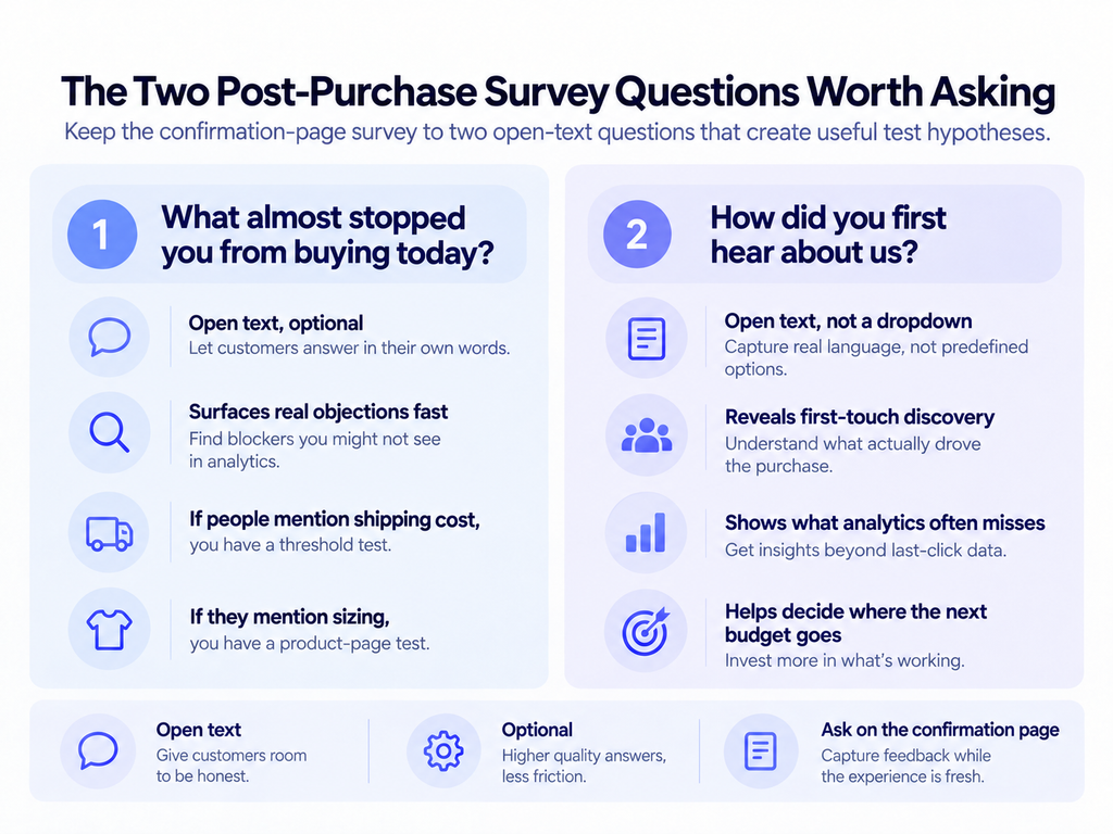
“What almost stopped you from buying today?”
Open text, optional. This is the highest-value question in ecommerce research and it is rarely asked, because it feels like inviting criticism after a win.
The answers cluster fast. Within a hundred responses you will usually see three or four repeated objections, and each one is a hypothesis with evidence attached. If forty people mention shipping cost, you have a threshold test. If they mention sizing, you have a product page test.
“How did you first hear about us?”
Open text, not a dropdown. Attribution modelling tells you the last click. This tells you the first touch, which is the thing your analytics cannot see and the thing that decides where the next budget goes.
Keep it open. A dropdown returns the options you already thought of.
The questions that waste a response
| Question | Why it fails |
|---|---|
| “How satisfied are you?” | They just bought. The answer is positive and tells you nothing. |
| “Rate your checkout 1 to 10” | A number with no mechanism. You cannot test against it. |
| “Would you recommend us?” | NPS before the product has arrived measures the buying experience only. |
| “What is your age / income?” | Available from other sources, and it costs you a response slot. |
| Anything with more than 5 options | Choice paralysis at the exact moment attention is lowest. |
The rule underneath all of these: if you cannot name the test a given answer would produce, the question does not belong on the confirmation page.
Designing for response rate
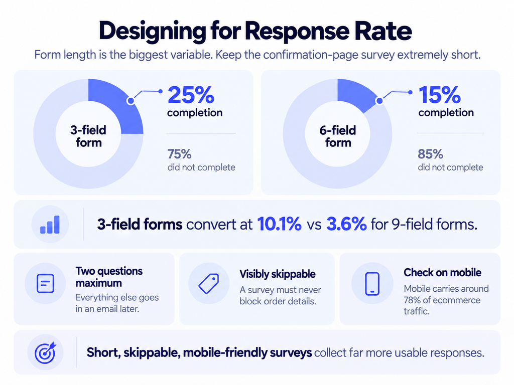
Two questions maximum on the confirmation screen. Everything else goes in an email a week later, when you can afford a longer form because the ask is different.
Form length is the dominant variable. Analysis of Unbounce’s 2026 benchmark data shows three-field forms converting at 10.1% against 3.6% for nine-field forms, and HubSpot research cited by LeadsuiteNow puts three-field forms at 25% completion against 15% at six fields, with each additional field costing roughly 11%. Survey forms behave the same way.
Make it visibly skippable. A survey that blocks the confirmation details is a support ticket waiting to happen.
And check it on a phone. With mobile carrying around 78% of ecommerce traffic, a survey that renders below the order summary on a small screen collects almost nothing.
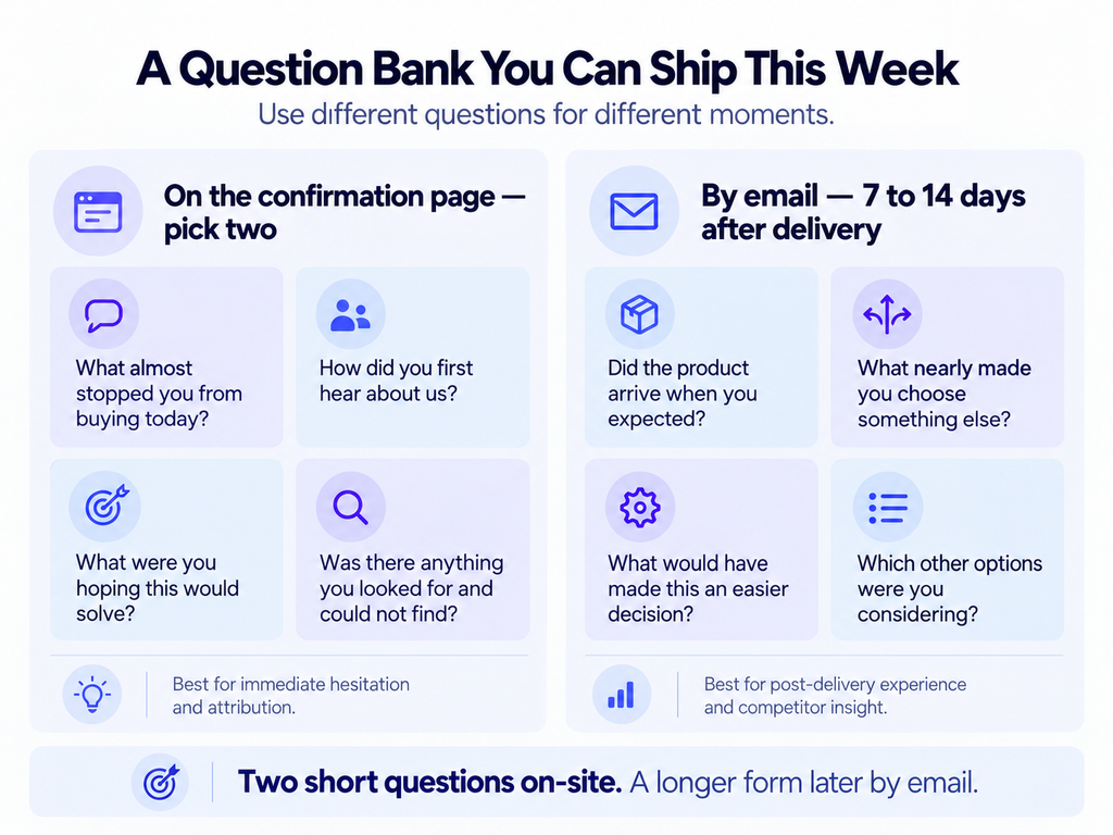
A question bank you can ship this week
Two on the confirmation page, and a slightly longer form by email once the product has arrived. Different moments, different jobs.
On the confirmation page, pick two:
- What almost stopped you from buying today?
- How did you first hear about us?
- What were you hoping this would solve?
- Was there anything you looked for and could not find?
The third one is worth rotating in quarterly. It surfaces the job the customer thinks they are hiring the product for, which is frequently not the job your product page is selling.
By email, seven to fourteen days after delivery:
- Did the product arrive when you expected?
- What nearly made you choose something else?
- What would have made this an easier decision?
- Which other options were you considering?
The last question is the most commercially useful and the least asked. Competitor names supplied voluntarily by your own customers are better competitive intelligence than any tool sells.
Coding responses without fooling yourself
Open text is only valuable if it gets processed consistently, and this is where most survey programmes quietly die.
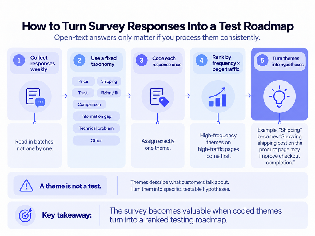
Build a fixed taxonomy of six to eight themes before you read anything: price, shipping, trust, sizing or fit, comparison, information gap, technical problem, other. Code each response into exactly one theme. Resist adding themes mid-way, because a taxonomy that grows every week cannot be counted across time.
Then rank by frequency multiplied by the traffic on the page the theme implicates. A theme mentioned by twelve people about your highest-traffic template outranks one mentioned by thirty about a page nobody visits.
Two cautions worth holding.
Volunteered responses skew. People who complete surveys are not a random sample of your customers, and they lean toward the articulate and the mildly annoyed. Treat the ranking as a hypothesis generator rather than a measurement.
A theme is not a test. “Shipping” is a theme. “Displaying the shipping cost on the product page will raise checkout completion because 48% of abandonments trace to unexpected costs” is a hypothesis with a mechanism. The gap between the two is where most survey programmes stall, and closing it is the entire point of the exercise. Baymard’s meta-analysis of fifty studies puts average cart abandonment at 70.22%, which is the scale of what these themes are pointing at.
Turning answers into a roadmap
Read responses weekly in batches, not individually as they arrive. Individual responses are anecdotes and they will pull you toward whoever complained most recently.
Code them into themes. Count the themes. Rank by frequency multiplied by how much traffic the relevant page receives. That ranking is your test roadmap, and it is better evidence than a competitor screenshot because it came from people who actually bought from you.
Then close the loop. When a test wins because a survey theme pointed at it, write that down. After two quarters the survey stops being a research tool and becomes the most reliable hypothesis source you have.
What the post-purchase surface is worth
Across the accounts we run, post-purchase upsells add around 10% to average order value, and that figure has held across a personal care brand under strict brand guidelines and a supplements brand with a completely different customer.
The survey and the upsell live on the same screen, which is the practical point. Once you are testing that surface at all, you are testing both the revenue mechanism and the research mechanism in the same place, and the research feeds the roadmap for everything upstream of it.
No research pipeline feeding your roadmap? The CRO Program builds the survey, the coding process and the hypothesis ranking as part of the first month.
What good looks like after a quarter
Three months in, a working survey programme has produced four things.
A ranked theme list, updated monthly, with counts rather than impressions. At least two tests that ran specifically because a theme pointed at them. A first-touch attribution picture that disagrees with your analytics in at least one interesting way, which it almost always will. And a small library of verbatim customer language you can lift directly into product page copy.
That last output is undervalued. Customers describe the problem in words your marketing team would never choose, and those words test well precisely because they are not marketing language.
If after a quarter you have responses but no tests traceable to them, the survey is a data collection habit rather than a research programme. The fix is not more responses. It is the coding and ranking step, which is the part that gets skipped when things get busy.
One operational note. Assign the coding to one named person rather than rotating it, because two people coding the same responses into a shared taxonomy will drift apart within a month and the counts stop being comparable across time. It is fifteen minutes a week, and consistency matters more than who does it.
Frequently asked questions
How many questions should a post-purchase survey have?
Two on the confirmation page. Response rates fall steeply with each additional field, and a longer form belongs in a follow-up email a week later.
Should post-purchase survey questions be multiple choice or open text?
Open text for both attribution and hesitation. A dropdown only returns options you already thought of, which defeats the purpose of asking.
Where should the survey appear?
On the order confirmation page, below the order details and clearly skippable. It cannot cost you the conversion because the payment has already completed.
How many responses do I need before acting?
Around a hundred coded responses is usually enough to see the three or four repeating themes. You are looking for pattern frequency, not statistical significance.
Next step: Website Conversion Optimization covers how research output gets turned into a prioritised test roadmap.